The Climate Charts Are Not Okay

Climate climate change
The Climate Charts Are Not Okay

The chart looks wrong. It looks like a malign mistake, or like two separate charts have been combined in some nefarious way. Like an abomination made mundane through math.

It is a chart of the daily average sea surface temperature for the world’s oceans, excluding the polar regions. Offered through the University of Maine’s Climate Reanalyzer site, it makes use of publicly available data from the National Oceanic and Atmospheric Administration, with individual lines for the temperatures each year back to 1981. I stare at it at least once a day now.

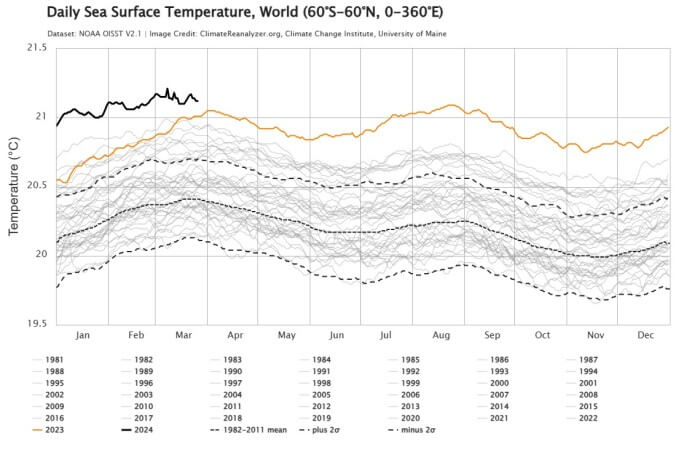
Just about one year ago, in the middle of March, the line for 2023 jumped past the previous record holder for that date, 2016. By April, the line had created some separation from its competitors. By June it looked like it didn’t belong to the same chart.

It stayed up there for the rest of the year, hovering significant fractions of a degree beyond every other piece of the available record, the dotted line representing the 1982-2011 mean laughably far below. Then 2024 began, and it got worse.

The excess heat in the ocean has become a thing of some concern for climate scientists, with the various possible explanations – a reasonably strong El Niño, water vapor from the massive 2022 Hunga Tonga–Hunga Ha‘apai eruption, reduced cooling effects from changes to global shipping fuels – not quite adding up to what the data tell us. Is warming accelerating, perhaps in line with James Hansen’s (of 1988 Senate testimony fame) somewhat controversial prediction

For the moment, 2024’s line on the chart is staying well clear of its predecessors, and staring at this continuing crime against nature has me asking myself over and over: if every day is a new record, is any day a new record?

This is, quite clearly, an absurd question. The answer is yes. Obviously. A record is a record. But that is what an era of constantly broken records does: it renders everything a bit askew, makes thought processes turn on their axes, makes us all a little bit crazy. And that’s the world now, records falling essentially every day. “The new normal” gets thrown around quite a bit, but it is true that “normal” has a new meaning now, and it is for records to fall. It is normal for the theoretically abnormal to occur. It would be weird and unexpected now if the records stopped falling. That’s the way it will continue to be.

It’s not just the oceans, of course. Last year was the warmest year in recorded history, and probably in at least 125,000 years. The U.S. saw more billion-dollar weather disasters in 2023 – 28 of them, from Hurricane Idalia in Florida to the Maui wildfires – than in any previous year. Antarctic sea ice cratered to unprecedented levels in 2023. The list of the ten warmest years on record includes each of the last ten years; ten years from now, it will presumably contain only those ten years, give or take an outlier from the current list.

This means that all the charts will look like that one up above, in one sense or another. They all look off, malign, nefarious; new colors get added to maps, y axes get stretched to their breaking point, scales are rendered unreadable. Terms like “record” or “outlier” start to sound inapt, less than fully accurate. The charts are hilariously underpowered attempts to depict just how out-of-balance we have rendered the world.

One can find some positives in the world of falling records, if one tries. More solar power installed in the U.S. last year than ever, say, or electric vehicle sales blowing past previous marks. But those charts just look like charts, relatively familiar tales of growing industries that don’t seem, intuitively and based on the data, to be able to keep up with the Bad Charts. The effort to slow climate change is in many ways an attempt to make the charts agree again, make them speak to each other in once-familiar languages. This, obviously, will not come easily. 

0 Comments
Inline Feedbacks
View all comments
Share Tweet Submit Pin